 (1)")
The graph describes the changes in Medical Funding in four countries from 2010 to 2018. Summarise the information by selecting and reporting the main features, and make comparisons where relevant.
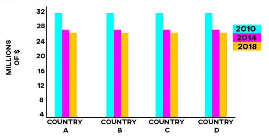
The given column chart reveals information about changes in medical funding in four countries such as A, B, C, and D between 2010 to 2018. The data is calibrated in millions of dollars.
Overall, we can see from the chart that investment in medical showed a higher trend in four countries in 2010 and it was slight fall in 2018 in country A, B, C, and D.
It is clear from the chart that there was a higher amount of investment in all countries in 2010. It was stood at 32 million dollars. In-country A, funding of the medical sector gradually decline from 32 million $ to 27 million $ from 2010 to 2014. A similar trend can be seen in country B. The medical fund was a moderate drop from 27 million $ in 2014 and 26 million $ in 2018 in country B.
In-country C, the investment of money in the medical sector was showed higher in 2010. It was accounted for 31 million $. It was a sharp reduction from 31 million $ to 26 million $ from 2010 to 2018. In-country D, a minority amount of funds was invested in 2014 and 2018, which showed approximately 27 million $ and 25 million $ respectively.
Follow Us on IELTSFever Twitter
Also, Read Describe a Skill You Can Teach Other People
Leave a Reply