")
The 3 pie charts below show the showing information of countries, coffee consumption, coffee production and the profit distribution around the world. Summarize the information by selecting and reporting the main features, and make comparisons where relevant. You should write at least 150 words.
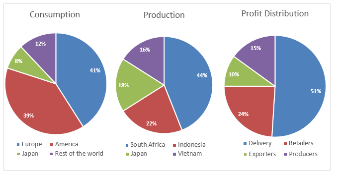
The three pie charts illustrate compression about coffee manufacturing and its utilization in some nations as well as gaining allotments to various shareholders which interested in the coffee business. The classifications are measured in percentage (%).
It is conspicuous from the given pie charts are that South Africa produced the highest coffee production while it was exhausted more in European countries. It is rarely apparent from profit parts is that delivery departments achieved more than half dividend in coffee work.
Explicitly, More than 40% of coffee is produced and utilized for drinking in South Africa and Europe respectively. However, Japan manufactured 18% of coffee products and consumed only 8%. The unites states and other countries consumption is 39% and 12% in addition production range are between 15 to 25% respectively for the USA & other parts of the world.
On further scrutiny, profit is the main interest for any business and hear 51 % profit gained by delivery divisions. Consequently, In more profit benefits retailers impressed and provide almost quarter share at the counter production. Lastly, the Production and export departments need to focus on the upcoming year for the coffee business as the profit side their contributions is below 15%.
Follow Us on IELTSFever Twitter
Leave a Reply