 (1)")
The graph below shows the pollution levels in London between 1600 and 2000. Summarise the information by selecting and reporting the main features, and make comparisons where relevant.
Sample, The Graph Below, Shows The Pollution Levels in London Between 1600 and 2000
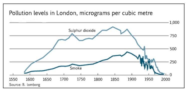
The line graph illustrates the information of the number of pollution levels in London, caused by sulphur dioxide and smoke from the level 1600 to 2000.
overall, it is apparent that there was a significant improvement in sulphur dioxide pollution level than smokMicrograms per cubics metre calculate ittre.
An in-depth analysis of the line graphs reveals that both pollutions start from approximately 1600, however over the 50 years were a significant improvement in both pollutions. Besides, between 1650, experiences a sharp increase in the case of sulphur dioxide reaching near 750 micrograms per cubic metre. Even though it roses first, steady decreases seem in 1750. While smoke saw a slow growth these levels. In addition to 750 to near 1900, the gradually reported peak micrograms per cubic metre (approximately 350). Whereas, sulphur dioxide, was dramatic increase level in between 1800 and 1850. And it’s peaked at more than 750.
Furthermore, from 1900 level experienced a sudden plunge in sulphur dioxide after that showed a fluctuated in the micrograms per cubic metre, then ended up to almost 0 amount. At the same time, smoke witnessed the same trend as in sulphur dioxide.
Follow Us on IELTSFever Twitter
Leave a Reply