
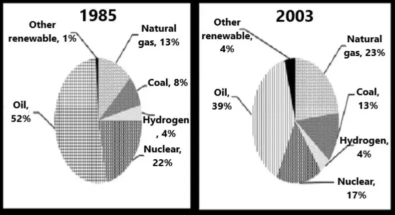
The charts below show the percentage of the energy generate from different resources in a country in 1985 and 2003. To summarize information by selecting key characteristics and compiling a report and, if necessary, making a comparison.
Sample Answer of The Charts Below Show the Percentage of The Energy Generate from Different Resources
The information about the dramatic change that has been made in the percentage of energy generation from various sources in the nation between 1985 and 2003. At first glance, it can be clearly seen that power generation from oil witnessed the big change from near half to near a third portion between the year of 1985 and 2003.
Another notable fact Is that natural gas and oil are the major sources to generate energy between both the time period. If we look at the details, as regards natural gas, there was over a one in ten portions in the year of 1985.
However, it goes up in the year of 2003. In conclusion, we can clearly note that the reduction in the use of nuclear and oil as the source of energy generation.
Follow Us on IELTSFever Twitter
Also Read Some Employers Offer Their Employees Subsidized Membership of Gym or Sports Clubs
Leave a Reply