")
The charts below show local government expenditure in 2010 and 2015. Summarise the information by selecting and reporting the main features and make comparisons where relevant.
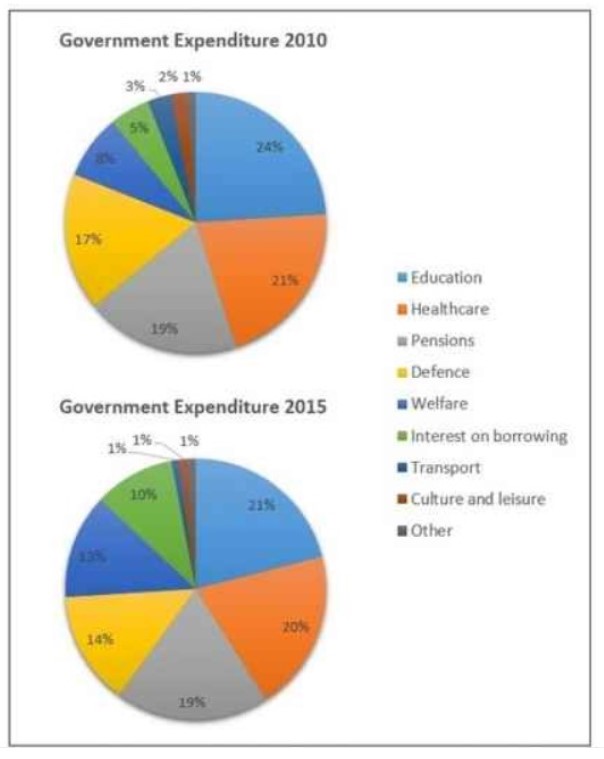
The provided two pie charts demonstrates different types of nine expenditure of local authority in 2010 and 2015
Overall, in both years, most government expenditure was education and healthcare while least was transportation, culture, leisure, and others.
In 2010, with 24%, education was on top of the table, and healthcare was in the second position with just above a quarter. 8% of fund use on welfare and almost double that used in defence with 2% and 1% culture and leisure and other fields received the lowest expenditure. Local bureaucrats spend 19% on a pension and 5% on interest on borrowing.
After a half decades, we can see a slight drop in education and healthcare expenditure, 21% and a quarter respectively; however, interest in borrowing had a double proportion than in 2010. 3% increased percentage on welfare. The pension had the same percentage as five years ago while 14% had expended on defence. Transport, culture and others and other had same proportion on account of only 1%.
Follow Us on IELTSFever Twitter
Also, Read The Graph Below Shows Radio and Television Audiences Throughout the Day in 1992
Leave a Reply