 (1)")
The bar chart below gives information about the percentage of the population living in urban areas in different parts of the world. Summarise the information by selecting and reporting the main features, and make comparisons where relevant.
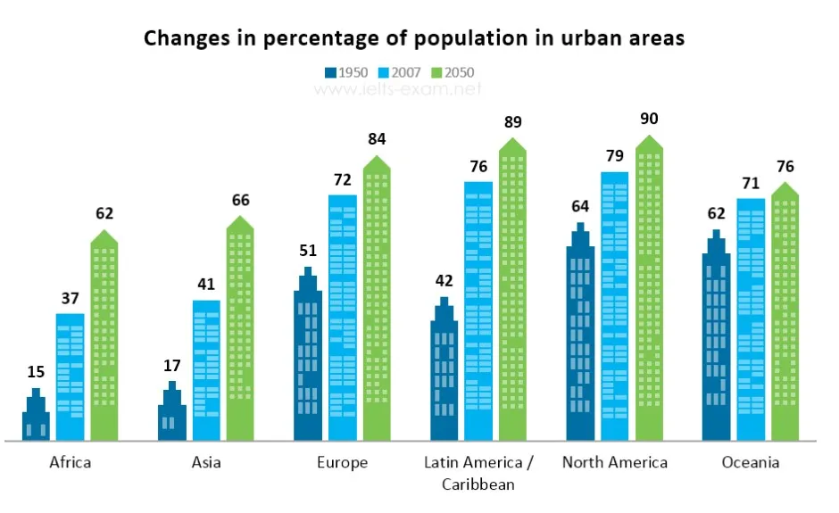
The given bar chart describes the proportion of people residing in urban areas in seven different countries over three years 1950,2007 and estimated to 2050.
Overall, the proportion of the urban population has remarkably increased in the past, and it will be higher in the future as well. All the given years, North America stands in the top position while the lowest urban demography is in Africa.
In the year 1950, Africa and Asia consistently accounted for the lower urban population, which was less than a fifth as opposed to this urban demographic ratio was significantly higher in North America, Europe and Oceania in each country showed above half of the population.
A similar trend can see in the year 2007. However, Latin America considerably increased their population than the previous year. All the countries except Asia and Africa posed above seven in ten ratios of population.
In the future year 2050, it is estimated that in the north and South America almost 90percent of people will be urban dwellers while Europe and Oceania show a moderate increase in the population which is 84 and 76 respectively. It is expected that the lowest urban demographic proportion will be in Asia and Africa. Both countries noticeably climbed the figure which is three fifth.
Follow Us on IELTSFever Twitter
Also read: The Bar Charts Below Provide Information About Honey Production
Leave a Reply