")
The graph below shows the amount of UK investments in clean energy from 2008 to 2015. Summarise the information by selecting and reporting the main features, and make comparisons where relevant.
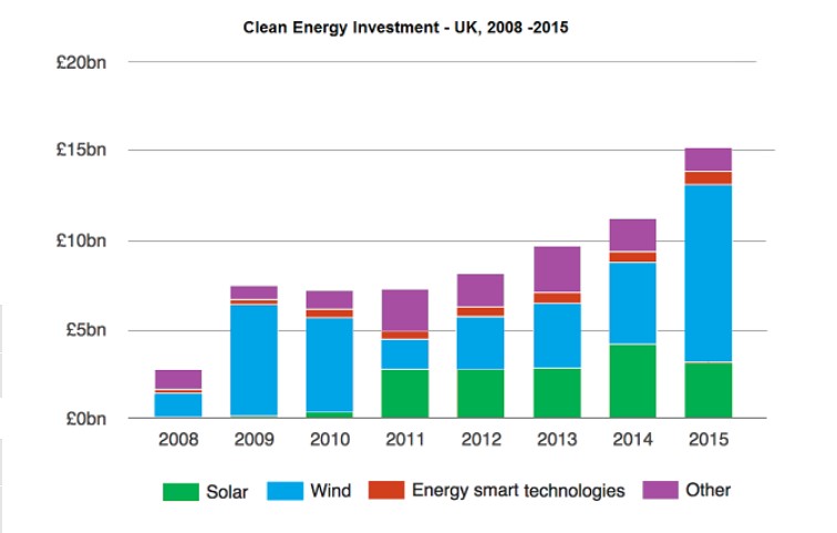
The chart shows total funding done by the UK over clean energies such as solar energy, wind energy, energy in smart technologies and others during the year 2008 to 2015.
As the year’s pass, investment in clean energy has been increased a lot, in which majority of money invested in wind energy. Investment in solar energy was started in 2010, consequently got the highest investment in 2014—a negligible amount was invested in the smart technology portion.
The portion of the money invested in wind energy is around 2 billion euros, which increased immensely in 2009 to 7 billion and drastically decreased in 2011 up to 4.5 billion only. After that, it continuously increased and reached around 9 billion euros in the year 2015. investment in solar energy begun in 2010, which is almost the same in the year 2011, 2012, 2013 and increased a bit in 2014, about 4 billion euro.
Energy smart technologies funding has gradually increased each year except 2010 and 2011 where it gets some downward movement. Investment in other energy expanded a lot more in 2009. Additionally, it becomes the same till 3 years, eventually get some spike each year after that.
Follow Us on IELTSFever Twitter
Also, Read The Charts below Show Local Government Expenditure in 2010 and 2015
Leave a Reply