")
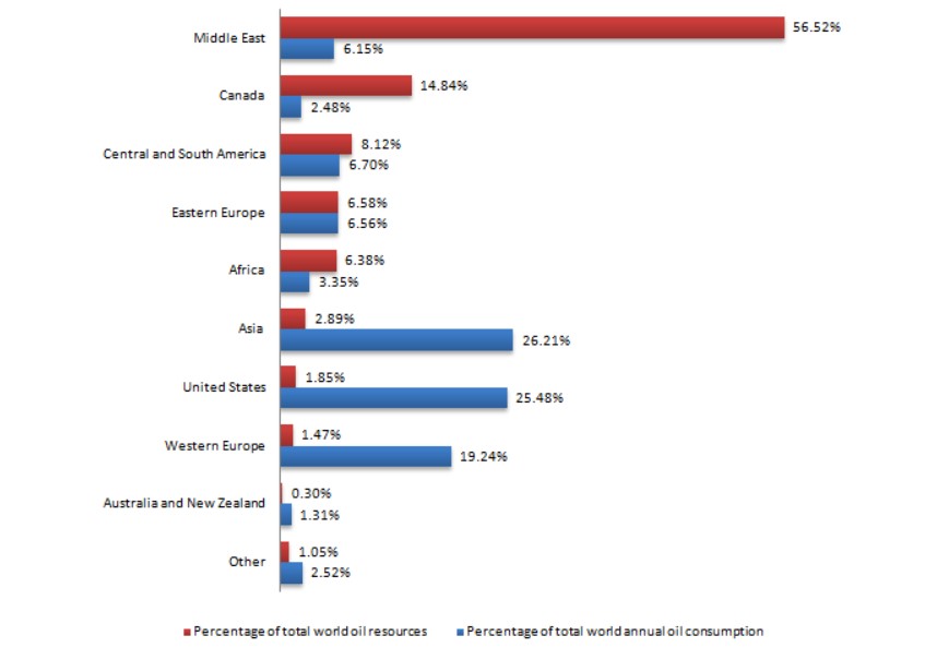
The chart below shows the proportions of the world’s oil resources held in different areas, together with the proportions consumed annually in the same areas. Summarise the information by selecting and reporting the main features, and make comparisons where relevant.
Sample Answer of The Chart Below Shows the Proportions of The World’s Oil Resources Held in Different Areas
The chart below depicts countries oil resources in percentage in different areas and usage by each country annually.
Overall, it shows that the middle East has spontaneously risen at the peak with the 56.52% total world oil resources, then it shows great drop throughout with Canada 14.84%, Central and South America 8.12%, Eastern Europe 6.58%, Africa 6.38%, Asia 2.89%, US 1.85%, Western Europe 1.4%, until it reduces drastically to 0.30%in Australia and New Zealand, then rise again to 1.05%in other.
On the other hand, the consumption reaches at peak by Asia country by 25.21% whereas their production is poor. And keep on dropping even the highest in producing continent their usage is minimal. Then Australia and New Zealand are significantly reduced to 1.31%.
In conclusion, it shows that the middle East the produces extremely was among the country that consumes lesser and vice versa.
Follow Us on IELTSFever Twitter
Leave a Reply