")
The 3 pie charts below show the showing information of countries, coffee consumption, coffee production and the profit distribution around the world. Summarize the information by selecting and reporting the main features, and make comparisons where relevant. You should write at least 150 words.
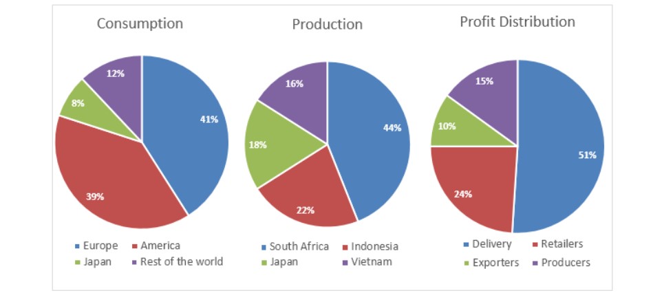
The three pie charts provide information about the countries data of coffee consumption, coffee production and profit distribution all over the world.
Overall, consumption and production of coffee in Europe and South Africa made up the highest significance of the chart. At the same time, Japan and Vietnam was the least part of the consumption and production. In comparison, delivery and exporters made the most and smallest part of the profit distribution in coffee.
Firstly, Europe and South Africa consisted the half of the coffee consumption, and production was 14% and 44%, respectively. However, in the consumption and production of coffee America and Indonesia made up 39% and 22%. In Japan had both consumption and production of coffee were at 8% and 10%, respectively. In coffee production, Japan had a growth of 2%. The rest of the world consists of 12% of coffee consumption. In addition, Vietnam produces more production at 16% in coffee.
Secondly, the delivery has covered half part of the profit production at 51%. Furthermore, retailers had also a profit of 24% in distribution and in both exporters and producers had only 10% and 15% of profit distribution in coffee.
Follow Us on IELTSFever Twitter
Leave a Reply