")
The pie charts show the average consumption of food in the world in 2008 compared to two countries. China and India. Write a report to a university lecturer describing the data.
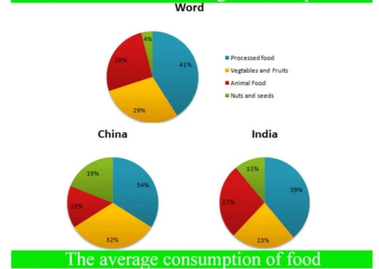
Sample Answer of The Pie Charts Show the Average Consumption of Food in The World in 2008 Compared to Two Countries
The given pie chart describes the consumption of 4 types of Food in Word 2008 ad compared with two countries listed India and China. Overall, both countries show different consumption ratios compared to the Word chart. The Processed Food is the largest amount for all.
A processed Food Consumption is highest for Word which is 41%, While in China and India has less than Word respectively 34% and 39%. Vegetables and Fruits are Most Used in China, about 32%, and In India, it’s 9% less compared to China, and For Word, it’s 3% less compared to China.
India has the highest level of Animal Food with 27%, whilst 15% of people eat non- vegetation. In China and For World is a quarter amount. Nuts and Seed more consumed by China and India (respectively 19% and 11%) compared to the world average. In Word, It’s less than half of people eat Nuts and Seed.
Follow Us on IELTSFever Twitter
Leave a Reply