
The line graph below shows the number of annual visits to Australia by overseas residents. The table below gives information on the country of origin where the visitors came from. Write a report for a university lecturer describing the information given.
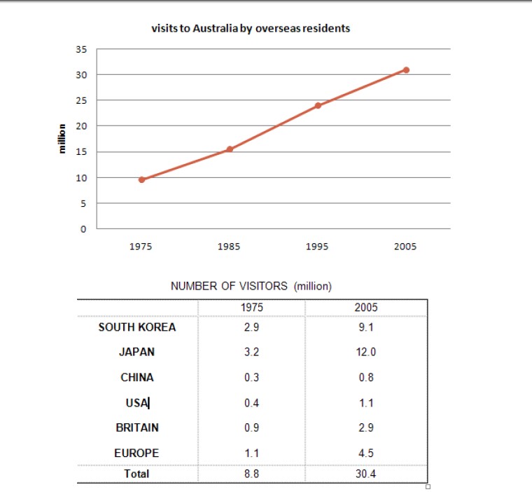 The below line graph delineated the number of people who visited Australia as non-residents from the year 1975 to 2009, while the table demonstrates the percentage of People who travelled to Australia from Several countries. Overall, Japanese citizens are fascinated with visiting Australia, while American people are curious to travel to Australia. The number of people visiting Australia by overseas Citizens has been gradually amplified over the year.
In 1975, only 10 million people travelled to Australia then it rose rapidly by every decade and its peak at 31 million in the year 2005.
While taking into consideration of table data, Japan and South Korea are the leading source of tourists to the Australia which is has been increased from 3.2 million to 12 million, 2.9 to 9.1 million respectively while USA and china represented a less drastic increase, 0.4 million to 1.1 and 0.3 to 0.8 million respectively.
Britain and Europe have witnessed a Similar portion of people. However, nearly 20 million visitors have been amplified over the period of 3 decades.
To conclude, Japan and South Korea are major sources of tourists while USA and china people are the least travelled to Australia and European countries account for a similar proportion of people.
Follow Us on IELTSFever Twitter
Leave a Reply