")
The graphs below provide information on global population figures and figures for urban populations in different world regions. Summarise the information by selecting and reporting the main features, and make comparisons where relevant.
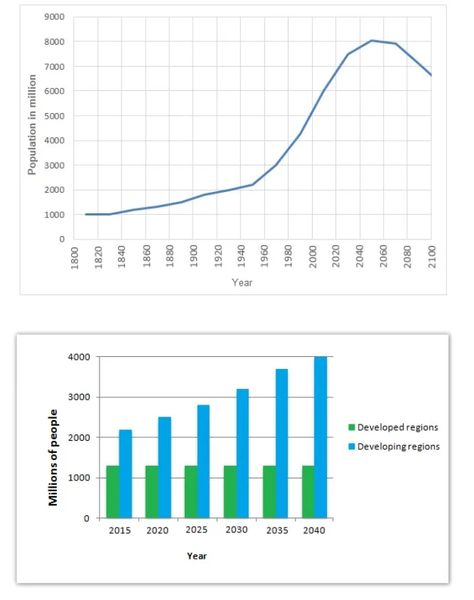
The graphs represent the increase in the world’s population in different urban regions.
The line graph shows the increment in the world’s population in the era from 1800 to 2050. In 1800, the population was 1000 million, which increased slowly over 120 years, about less than 2000 million. This population change is prolonged. In 1970 the population grew to 3000 then graph steeped up gradually with years in 2050 highest peak at 8000 million. The chart moves down to 2100 population is about less than 7000 million.
The bar graph gives information about the population in developed and developing nations. In developed countries, the chart remains constant from 2015 to 2040 is, about above 1000 million people. But in developing countries, the graph shows the gradual increase in population, in 2015 the population was just over 2000 which rose gradually with time and in 2030 it is above 3000. In the period of ten years, it increases to a 4000million in population.
Follow Us on IELTSFever Twitter
Leave a Reply