


The chart and graph below give information about sales and share prices for Coca-Cola. Summarise the information by selecting and reporting the main features, and make comparisons where relevant.
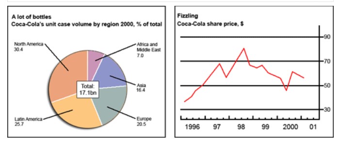

The pie chart and line graph illustrate Coca-Cola’s unit case volume by region 2000 and share price from 1996 to 2001.
Overall, North America, Latin America and Europe were the highest Coca-Cola’s market in 2000, and this firm fluctuated in share prices from 1996 to 2001.
It can be seen that in the pie chart, North America was the first highest unit of Coca-Cola’s products as the region generated 30.4%. Latin America consuming the second greatest unit of Coca-Cola’s items was 25.7%, and Europe consumed 20.5% of Coca-Cola’s goods. Asia, as well as Africa and the Middle East, were the lowest units of coca-cola (16.4% and 7.0%, respectively).
Moving to the line graph, it was approximately $38 per share in 1996. After that, it climbed and reached nearly $69 per share. Then, its follow up and down pattern till 2000, just under $50 per share. Again, its increase and then slightly down was close to %58 per share in 2001.
Follow Us on IELTSFever Twitter